Good eCommerce Website Design for B2C Companies
What makes for good eCommerce website design? Knowing your customers well and designing and developing your eCommerce website around your customer’s needs is always a prime consideration in any website design.
No two eCommerce websites should be precisely the same as every company is different, but most will encompass certain basics in terms of pages, site layout and information which would typically include the following pages:
- Homepage
- Product Categories.
- Product Pages.
- Checkout process.
- About Us.
- Site Search.
- Account Registration and Login Forms.
- Email Subscription Forms.
- Legal Requirements.
The process of eCommerce is very similar to the brick-and-mortar experience. You attract as many potential customers as possible to your store and make the shopping experience as simple as possible from being able to find the correct products quickly to providing a convenient & painless checkout process. Check out our top 22 tips for effective eCommerce.
Contact Us for your eCommerce Development Requirements.
Develop Your eCommerce Store For Your Customer
For good eCommerce Website Design, it needs to be designed and developed with the customer in mind. We experience the same types of customers in an Online Store as in a brick-and-mortar store, the customer’s journey is the same. Every customer follows the buyer’s journey and will interact with your eCommerce website depending on where they are on this journey, so make sure you have everything these potential buyers need to encourage them through the buyer’s journey, to becoming not just a paying client but an advocate for your business.
The Buyers Journey
The Browser – Awareness Stage
This person has walked past your store and has been attracted by something they have seen in your storefront, or similar online, they may have been searching on Google for something or seen an advert and clicked through to your site. They have become aware of a need that a product or service you provide may fulfil.
Your Hompage is the page that most site visitors will land on, so make sure it’s on Brand and clearly defines who you are, what you do and what the site visitor should do next.
This person is willing to shop around to see what they can find. They will be attracted to a certain Department in your physical store or Product Category in an online store and take their time walking up and down each aisle in that Department or subcategory online. They may explore every department/category.
This person is not very far along the buyer’s journey and may just be performing their initial research, it’s unlikely that they will make a purchase at this stage but creating a positive experience will help them to remember your store and increase the chance of them returning.
A slow or poorly designed website that is difficult to navigate may be enough to cause this potential customer to leave your website very quickly and chances are they may never come back again, so keep your design simple, clean and logical.
Offering this shopper a voucher or something of value just before they leave your store in exchange for an email address can help to further nurture this potential customer and increase return visits. You might be shocked to learn that 96% of first-time visitors to your website will probably never return – so do everything you can to get that email address.
Potential Buyer – Research Stage
The next person would be the potential buyer, this person is performing their initial research and has a good idea of what they are looking for but might not buy yet. This person will actively seek out your store.
Upon entering a brick-and-mortar store, they will immediately look for the Department and Aisle that contains the product range they are looking for or they might approach a salesperson to inquire about the location of the desired products.
It’s unlikely that this person will browse other Departments.
This customer will behave in the same manner in an online store, they will either go straight to the Category and then the Sub Category they desire or will make use of the search function to immediately find the products. In this case, the Search Bar provides the same function as an in-store salesperson. Hence the reason for offering good Search functionality and Filtering capabilities on your eCommerce website. Make sure your product categories are logical and easy to navigate.
It’s vital to provide detailed information for each product to enable this customer to perform adequate research which will help them to make a decision and ultimate purchase. In some cases, depending on the nature of the product the ability to compare products and specifications side by side will also help.
There is a good chance that this person may make a purchase there and then if you have the right product, in stock at the right price he can complete the purchase without too much fuss.
If a purchase is not made then make an offer to encourage return engagement and consider adding an effective Cart Abandonment tool to improve your e-commerce conversion rates, just in case they added the product to their cart.
Decisive Buyer – Decision Stage
The last type of visitor is the decisive buyer, this person has completed their research and knows exactly what they are looking for and at what price. They will walk into your brick-and-mortar store and seek out the specific product or ask a salesperson to point them in the right direction. They will pick up the product and head to the checkout.
This customer will behave in the same fashion online, they will go straight to the product via the menu and categories or perform a search for the product and immediately add the product to their cart. It’s vital to have logical product category layouts and offer good Search and Filtering capabilities on your site so this customer can find the products easily.
The only thing that will stop this determined buyer now is a poor checkout experience so make sure your checkout process is simple, and smooth and offers the required payment options. Don’t request too much information or have hidden costs that get added at checkout. This is one sure way to kill the deal.
We tend to overly complicate the eCommerce process believing that potential customers require a plethora of fancy tools and tactics to encourage sales when in reality potential customers require only two basic functions from an Online Store.
- The ability to find and research the products.
- The ability to purchase the products.
Your eCommerce site should provide these two functions in a simple manner that makes it easy for the customer to complete the transaction as painlessly as possible.
Contact Us for your eCommerce Development Requirements
The Good eCommerce Website Design
HomePage
Your Homepage is the equivalent of your storefront, it must be immediately recognisable and On Brand and make it clear as to what products or services you provide, it should further entice visitors to “Come on in” and continue shopping by featuring “Best Sellers” or “Latest Offers” in your Online Window.
It is very typical to have a menu that includes the Main Categories across the top of the page followed by a hero image and Title that together say who you are.
Other norms for a good Home Page include your Company Logo top left the logo also doubles as a link to your home page, contact details and Site Search Bar. Ideally, a site visitor should be able to perform all the important functions without having to scroll any further down the page.
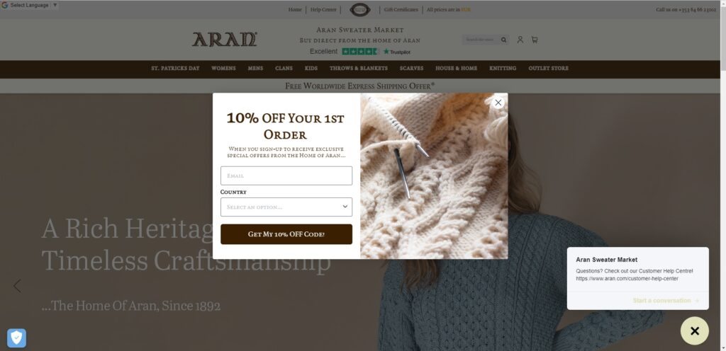
Aran, below, has fulfilled all of the requirements for a good eCommerce Homepage design including a pop-up offering 10% off your first order to not only promote sales but to build an email list. Adding Live chat, in the bottom right-hand corner can improve sales conversions, it’s like having an online salesperson.
A good home page design depends on your industry and your customers, some suit a quiet professional look whereas others may want to create more excitement and be busier.
Categories
Upon entry into your store, your visitors should immediately be able to identify the main Categories or Departments. A brick-and-mortar clothing store would have sections for Men’s, Ladies and Kids’ Clothing, and a Car Dealer would have separate areas in its showroom for New and Second Hand Cars.
Within these sections or departments, a store would most likely have further aisles or subcategories under the main categories. For example, under the Mens Clothing Category, we would expect to find subcategories for the different clothing items such as Shoes, Pants, Shirts, Jerseys, Jackets etc the Car Dealer would break their range down into specific models such as Sedans, Hatchbacks, Touring & Sport etc.
Categories should be All Inclusive but Mutually Exclusive, this means that every product should fit into a category, but no product should be in more than one category. This keeps things very simple and easy for site visitors to navigate and contributes greatly to good eCommerce website design.
In a real-world brick-and-mortar store, you wouldn’t see a supermarket putting milk in the Dairy aisle in the “Baking” aisle and in the “Breakfast Cereal” aisle and next to the Tea & Coffee, yes Milk is often used in baking and in cereals but its main category is Dairy. It’s just not practical to place it in multiple places throughout the store.
Unfortunately, these practical limitations do not exist in an online store and often the temptation to put products in multiple categories and offer multiple sub-categories that include the same products is just too strong to resist resulting in an overly complicated and messy online store with products being placed all over the place and numerous subcategories being created just because it seems like a good idea and we think it will sell more.
From an SEO point of view Product Category pages should have a descriptive SEO-friendly URL and unique SEO-friendly text, they should fit logically into your overall architecture and include filters to aid in product searches.
Remember the basic rule of KISS – Keep it Simple, Silly!
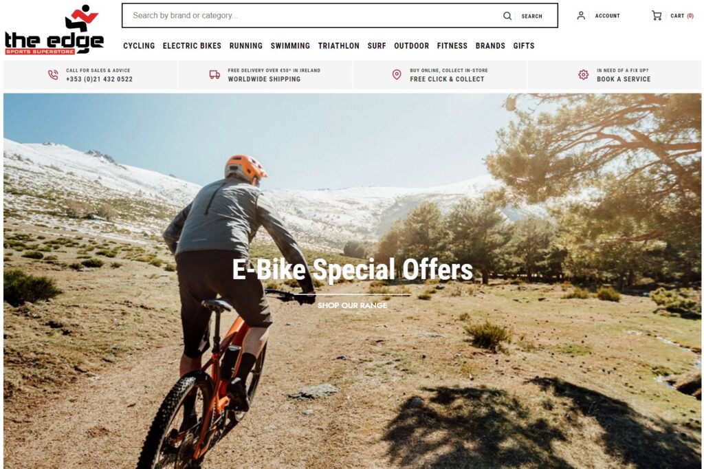
The Edge Sports Superstore, below have done a good job of keeping its primary Categories simple and easily accessible across the top of the page, sub-categories are visible when the menu items are clicked on. They have further added images on the homepage that also link to the main categories (Not all visible in the below screenshot).
They have also included important information and the Site Search Bar on top of the page.
eCommerce Website Product Pages
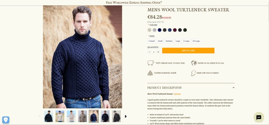
Product detail or landing pages perform the same function as your in-store salesperson by providing the customer with all the information they will need to make an educated decision to purchase. The below examples of the Aran Wool Sweater have covered most of the points that make for a good product landing page that contributes to good eCommerce website design.
This should include:
- Multiple quality images of the product from different angles. This should include images of real-life people making use of the product. Ideally, this should include the ability to zoom in or view larger full-size images. In the above case, the images include the different colours available and being worn by different people helping to appeal to a wider audience.
- If possible include a video of the product this enables the customer to “experience” the product better.
- All the different Colour and Sizing options are visible to be selected.
- The Product Title and Pricing are visible on the top of the page, in this case, it’s also obvious that this product is currently discounted to encourage a sense of urgency.
- The ability to choose quantities and the “Add to Cart” button are right next to each other and the “Add to Cart” Button stands out using a bright colour.
- It is always a challenge to get all the necessary details on the page to be “Above the Fold” (Visible without having to scroll down the page) Aran has made clever use of Tags that provide the detailed Product Description and Delivery & Returns at the click of a button.
- When Product Description or Delivery & Returns are not selected then the “Add to Wishlist” button is visible above the fold.
- The detailed Product Description provides further information about the product and outlines some of the benefits, it also offers links to a popup Product Reviews page and Product sizing guide and provides further details of the Free Shipping offer. All the information a potential customer needs to make an educated decision and encourage a purchase.
- Further down the page are “Related Products” and “Customers Also Purchased” recommendations and some more Brand Story content to further encourage sales. (Not visible in the below screenshots)
Aran has successfully covered all the requirements for a good product page, all the necessary information required to place the order such as price, options, quantities and the “Add To Cart” button are all close together and above the fold, so the customer does not have to scroll up and down to place an order.
They have provided numerous quality images of the product range being worn by models of different demographics to appeal to a wider audience and provided all the required information for a potential customer to make an informed decision.
The overall impression of the page is professional providing the customer with a sense of confidence and trust in the company.
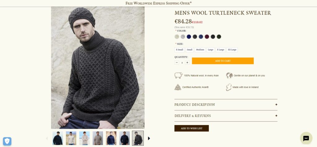
Another error we often see is the incorrect use of product types where variations of a product are created as Simple Products (Single Products) instead of making use of Variable Products, below is a good example of a Variable Product. The Aran Mens Wool Turtleneck Sweater is available in 8 different colours and 6 different sizes resulting in a total of 48 different variations of the product.
Either through ignorance or a deliberate attempt to make a store appear bigger, some outlets load all variations of a product as separate products. This is not good practice for numerous SEO and maintenance reasons but most importantly you are forcing the customers to have to search around your site to find the correct colour and size which is not a good user experience, there’s a high probability this customer may get frustrated and leave your store.
Checkout Process
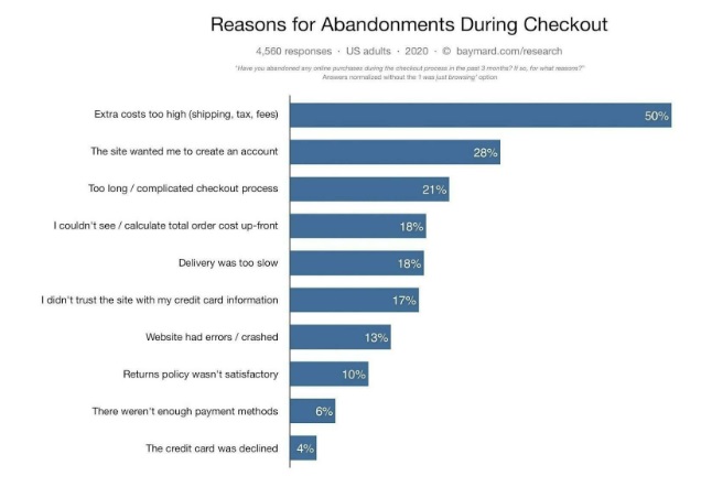
With the average Cart Abandonment rate averaging around 70% the bottom of the funnel is definitely in need of some tender loving care. The ability to purchase the product is one of the two primary functions any customer expects from an Online Store yet it can be one of the most neglected sections.
In many cases, it’s simply ignorance or lack of resources that results in a poor checkout experience, not everyone can test and re-design carts and checkout pages, but some simple rules can improve even the poorest of checkout pages and form an essential part of good eCommerce website design.
- Keep the design of the checkout pages clean simple and easy to navigate
- Break the process into logical steps highlighting each required step.
- Allow the option to checkout as a Guest, don’t force a potential customer to create an account but offer it as an option.
- Make it crystal clear what information is required and what is optional and don’t ask for more information than required to complete the transaction.
- When a customer makes an error in the process explain very clearly what needs to be done to correct the error.
- Have customer service contact details available on the Checkout pages.
- Provide the choice of different shipping options available, and offer Free Shipping if possible, even if you add it to the price of the product or require a minimum order value.
- Do not add any surprise costs during the checkout, any additional costs should be discussed earlier in the process.
- Use the Billing Address as the default Shipping Address.
- Remove all distractions from the Checkout process, such as pop-ups.
- Offer all relevant payment methods, Credit Cards are no longer the only online payment options.
- Include a confirmation page so the customer knows their order has been successful.
- Include Logos of all the security features you have included to build trust and confidence.
There are numerous reasons why a potential customer may not complete the checkout process
About Us
More people check out the About Us page than you would think, it’s particularly important for B2B companies, but many site visitors to a B2C eCommerce site will also check out the About Us page, especially if you are not a well-known Brand.
Ultimately people still like to feel like they are dealing with people and introducing your team puts a face to the company, telling the story of your Brand and History gives you personality.
Explain who you are, what your values are and your vision for the future. This should not be seen as an opportunity to promote sales but rather as communication with your customers and building a connection.
Site Search on eCommerce Websites
The online equivalent of the in-store salesperson.
As discussed earlier in the article there are two kinds of shoppers, those who are willing to browse around, even though they may know what they want they are willing to look around until they find it in case they find something else as well, this person might eventually give up looking and hop on the Site Search bar.
Then we get the other type of shopper. The shopper who knows what they want and wants it as quickly as possible, this person does not have the patience for browsing and will hop straight on to the Site Search bar and look for the specific product or range.
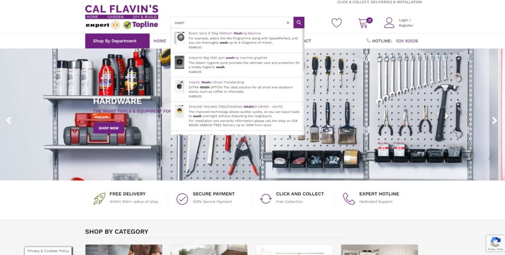
It is worthwhile investing in good Site Search functionality, some Site Search plugins offer poor functionality and only find the correct result if you spell the product name 100% correctly even down to an apostrophe. This will probably only frustrate your customers even more.
On Cal Flavins we implemented a more powerful Site Search that expands the search to any products that contain the sought word in the Product Name or Description and brings up recommendations as you are typing.
A really good Site Search function should allow for misspellings, offer auto-complete and provide personalised results based on analytics, but this may be limited by your budget. According to Looker.io 43% of visitors on retail websites go directly to the search bar and these visitors are 2-3x more likely to convert. These searchers are responsible for up to 40% of revenue.
Need we give you any more reasons to ensure you provide good Site Search functionality?
Account Registration and Login Forms
Keep account registration and Login forms short and sweet, other information can be obtained later. Initially, you just need a Username and Password or offer the ability to Login using Social Media. Offer the ability to save and reuse their information in an address book.
Email Subscription Forms
Most of your eCommerce site visitors will only visit your site once, you need to be able to encourage these visitors to return and Email is the perfect tool for this. Start building a list as soon as possible. Drip is an email marketing tool developed specifically for eCommerce offering a range of powerful email marketing tools to help you build your email list and improve conversions on your eCommerce platform.
Static forms are one way to gather emails, but pop-ups do convert at a much higher rate, it’s also a good idea to offer site visitors a discount on their first purchase for signing up.
Initially, all the information you need is a Name and Email address, you could limit it to an Email address only but that makes it very hard to personalise emails.
Drip offers some powerful automation functions to help you reduce Cart Abandonment and generate repeat sales to past customers limited only by your imagination.
Legal Requirements
In Europe, we have GDPR that places a legal requirement on website owners to not track online activity without the visitor’s permission.
You further need to have a Privacy Policy and a Terms & Conditions page.
Contact Us for your eCommerce Development Requirements